DYMOND
Designing a digital mental health probe
Team
UbiWell Labs, Northeastern University, Dartmouth College
Skills
Mixed Methods UX Research, Usability Testing, Figma
Role
User Experience Researcher and Designer
Timeline
44 Weeks
FitBit - But For Mental Health
At my most recent co-op, I worked as a User Experience Researcher and Designer at UbiWell Labs, a health computing lab based in Northeastern. I was brought on to continue the research of Postdoctoral Fellow Vedant Das Swain on how participants interact with their mental health data.
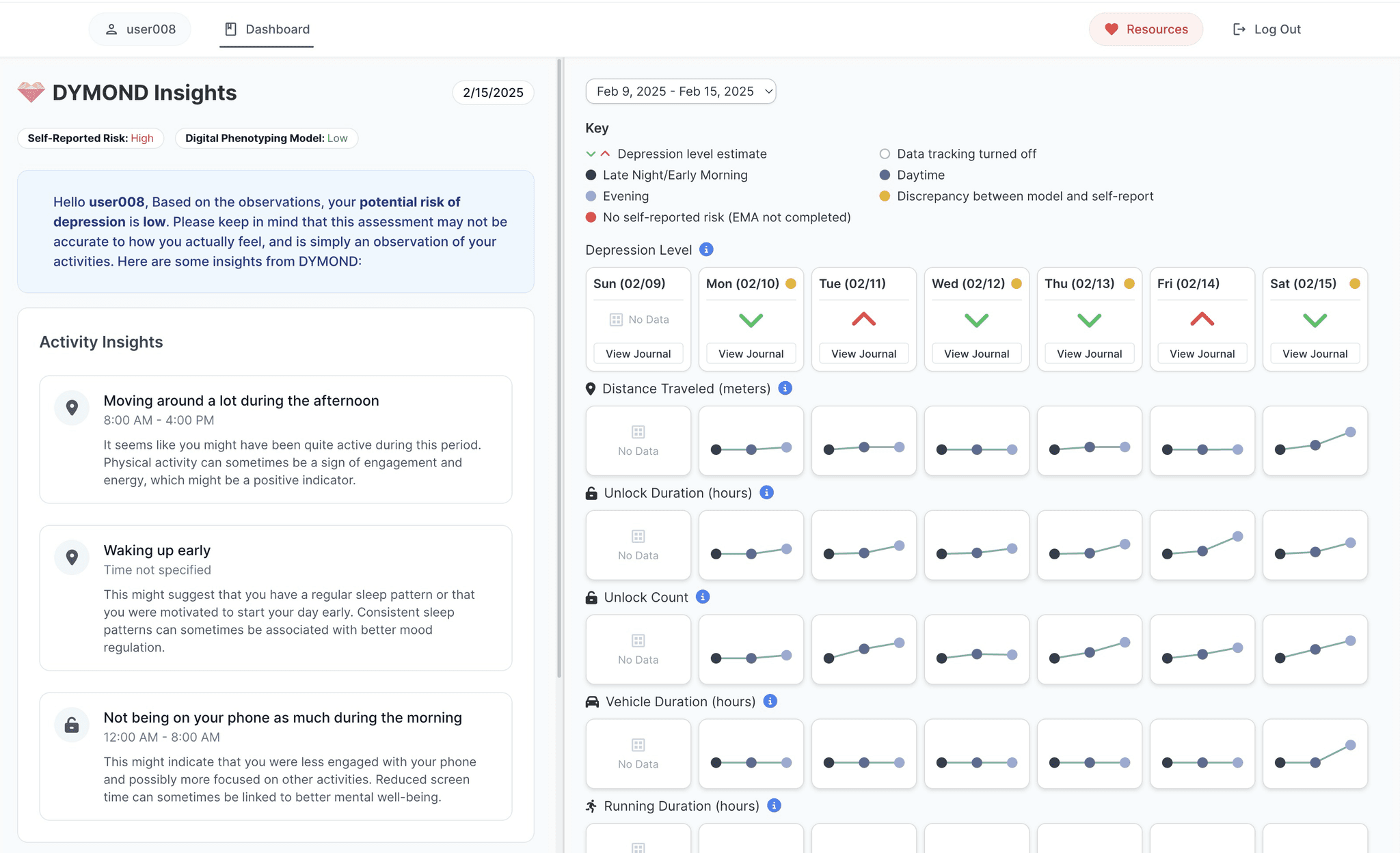
Similarly to how activity trackers like FitBits track user data and generate insights optimizing health, we provided participants with Garmin watches and developed DYMOND (Dynamic Monitoring for Depression), a web-based dashboard allowing participants to reflect on their tracked data, review AI-generated depression estimates, and provide model feedback. DYMOND aims to support personalized and ethical mental healthcare.
Research Goals
Identify usability and trust barriers in passive sensing for depression.
Understand how users interpret, accept, or reject AI-driven mental health inferences.
Explore how participants want to configure wearables + ML pipelines.
My Role
As the user experience researcher and designer, i wore many hats.
Wireframed, designed, and prototyped a mental health tracking dashboard
Delivered weekly insights to team of researchers and developers
Moderated bi-weekly participant check-ins and co-design sessions for 20+ participants
Coding 45 hours of user interviews to analyze users’ digital health needs and behaviors
Designing a Mental Health Tracking Dashboard
While I had little experience with designing mental health trackers, I approached the problem statement with what I do best: asking questions.
Conducted 5 competitive analysis with health AI experts
Read and synthesized 5+ research papers on depression monitoring and HCI


"I think I realized through Pearl and if I were to design it again might design it differently is that most everyday people don't know where to start with really Advanced statistical visualizations."
Matthew jorke, PhD Student at Stanford University
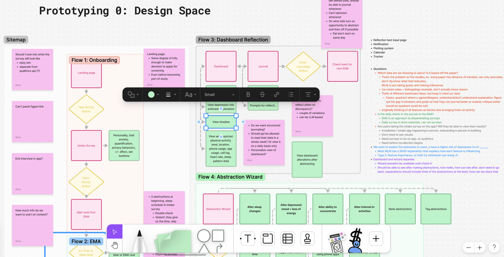
Site Mapping
Through site mapping, I identified 2 primary flows: participants reflecting on the dashboard through journaling, and participants making changes to the MLM.
WIREFRAMING and hi-fis


Final Product
User Research and Testing

Throughout 2 study cycles, I interviewed 20+ participants over 3 bi-weekly check-ins to inform our research goals. I developed scripts with questions probing the dashboard's 3 main flows: data visualization, insights and journaling, and model setting changes.
Each check-in was accompanied by a co-design exercise where we asked participants how they would re-design our main flows.
Synthesizing Insights
After conducting 40+ hours of interviews and synthesizing interviews via thematic analysis, we have a greater understanding of how participants would like to interact with their mental health data.
The role of the MLM and dashboard in affirmation feedback
Importance of reflection
One size doesn't fit all
Designed with <3 by Olivia Wang