Asian Student Union
Designing for Northeastern's community
Client
Northeastern University
Skills
Branding, Illustration, Photoshop, Illustrator, AfterEffects
Role
Media Specialist
Timeline
52 weeks, Spring 2022 - Spring 2023
Capturing the Asian American Spirit
As Media Specialist, my primary goal was to build out the Northeastern Asian Student Union's brand.
With the the increasing significance of social media, especially Instagram, being used as a megaphone for university events, I wanted to give ASU an iconic look that could be easily recognized in any post or story.
A Fresh Start
Creating branding that encompasses an entire group of people can be overwhelming. To kick off the process, I developed moodboards that supported ideals I thought were most important to the brand.
ASU's three pillars: Spirit, culture, unity
Flexibility in design exploration
A vibrant, multi-faceted community
Many Pinterest boards later, I landed on a direction that I felt best represented ASU's visual identity. I was heavily inspired by physical manifestations of the creative process–ie. scrapbooking, mark-making–and their digital translations.
Because the nature of this direction is to experiment, it prevented me from being confined to a singular, monotonous style– all while keeping the overall branding intact via type and color choice.
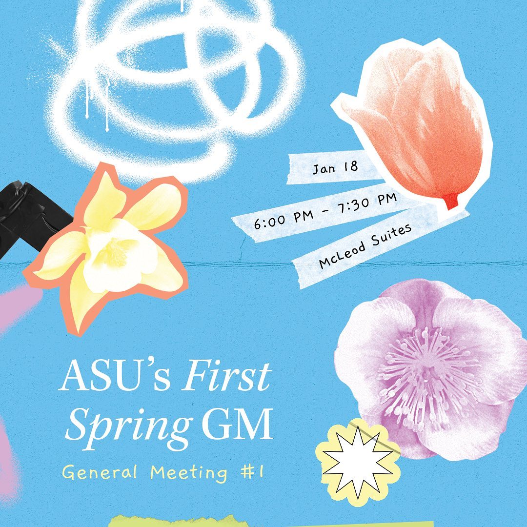
Social Media
Using hand-made elements designed on Illustrator and Photoshop, I created over 50+ Instagram posts, banners, and stories over the course of a year.


Event Collateral
ASU hosts three big events each semester. To promote each event, I created posters, performer graphics leading up to the event, and recaps afterwards. The look and feel of these graphics deviate from the base branding to signify their scale.
Appreci(Asian)


Culture Show: After the Tone


What I Learned
Being ASU's media specialist was a massive undertaking. However, with any seemingly insurmountable challenge, I learned a lot about design and myself through the process.
A lesson on perfectionism
My boundaries as a designer were definitely tested in this role. With weekly events came a constant demand for graphics, which went at odds with my then highly perfectionist tendencies.
I quickly learned that small flaws I was hyperaware of in my designs weren't even registered by the audience. With that knowledge, I now iterate from the perspective of a viewer instead of my own. Doing so detaches personal biases from my work and allows me to focus on designing for a larger context.
Less is more
Student turnout consistently depended on the event's content rather than any number of well-designed graphics. This was a hard pill for me to swallow– but a necessary one.
Small, consistent efforts outweigh larger, sporadic ones in any context. My goal in producing content shifted from overhitting the mark with each graphic to comfortably achieving a quality baseline, streamlining the design process and combatting unnecessary stress in the process.

Love My Eboard <3
Designed with <3 by Olivia Wang